Restyling of a Capital Management Company:
how to turn a brand without value
into one that communicates.
The challenge of this project was transforming a logo without value into one that could communicate. During the briefing, we had established the need to find a brand that could embrace the following values: stabilization, solidification, safety, justice, regularization and concreteness.
Furthermore, my client wanted to communicate the more personalized relationship they sought to offer their investors and the constant assistance they could provide along the entire process of Asset optimization.
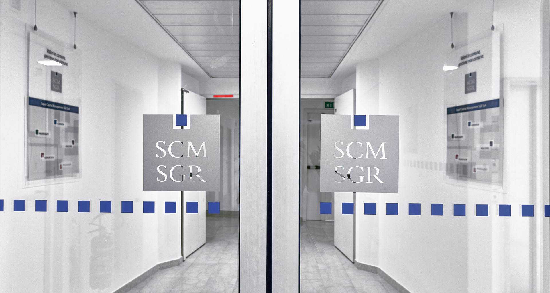
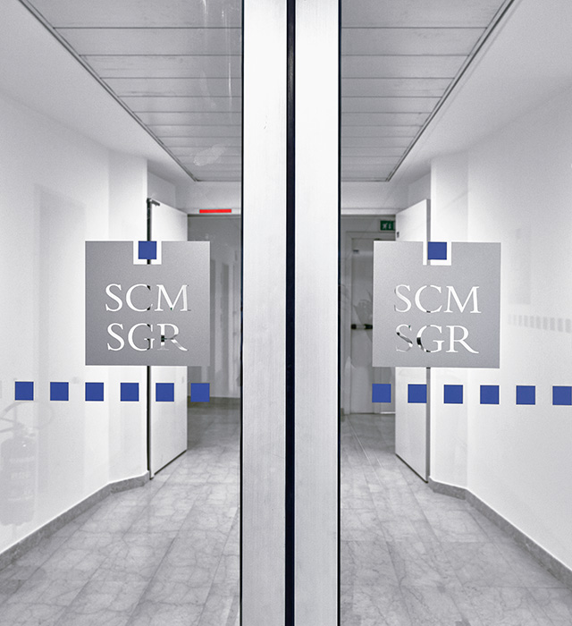
The choice of a quadrangular structure is meant to represent the regularization of that which, by its very nature, would have otherwise remained chaotic and without shape (a reassuring metaphor of financial markets). The square symbolizes rigor, precision, and solidity; in fact it is a shape that had already been adopted by Pythagoreans as a symbol of justice. All the values we instinctively associate to the square played in our favor; values that reveal themselves even in our sayings and expressions: “a square person”, i.e. someone straightforward, reliable, serious, precise, stable. The colors were chosen to create a link with the parent company SOPAF.
BRAND IDENTITY, CORPORATE IDENTITY, SIGN DESIGN, WEB DESIGN, ADV
The little colored square on top (the most distinctive element of the entire brand) is not fully englobed in the square, but lives in its own free and well-defined space. From the point of view of corporate communication, it represents the added value of the company, i.e. its open-mindedness and constant sense of evolution. From the point of view of the market, it represents the missing piece in managing the customer’s capital: it makes him feel looked after and protected in a solid and square context.
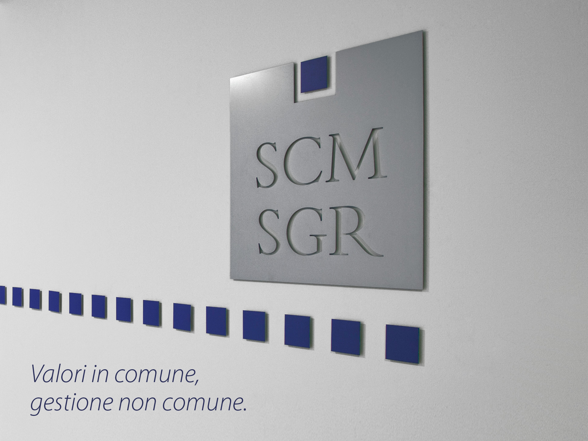
The pay-off, which is present in every corporate communication, is based on the concept of co-investment that SCM – SGR’s operations are based on. Sharing the same values as the customer communicates a reassuring message, about shared risks and management results, and at the same time speaks about an uncommon kind of management, which has been part of Sopaf’s spirit from the beginning.


A clean and concrete graphic design was chosen for the brochure, with innovative and immediately attractive titles and graphic elements to communicate clearly and directly with the customer. On the cover, the logo is on a white background (to instinctively communicate cleanliness and transparency) and it is further enhanced by a shiny screen print on matt paper.


The product families are identified by strong colors, which create a harmonic and elegant color scale together.
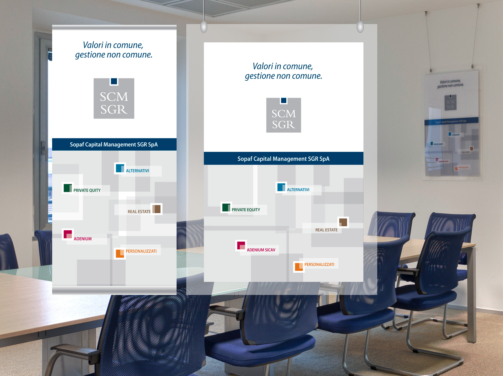

The guiding image I chose is based on a game of transparent squares (precisely transparency is a key concept for SGR). The different layers of these squares make up many small bricks or pieces, like in a puzzle, with a contemporary appearance, which create a connection with the claim of the campaign: “The missing piece in your capital”.
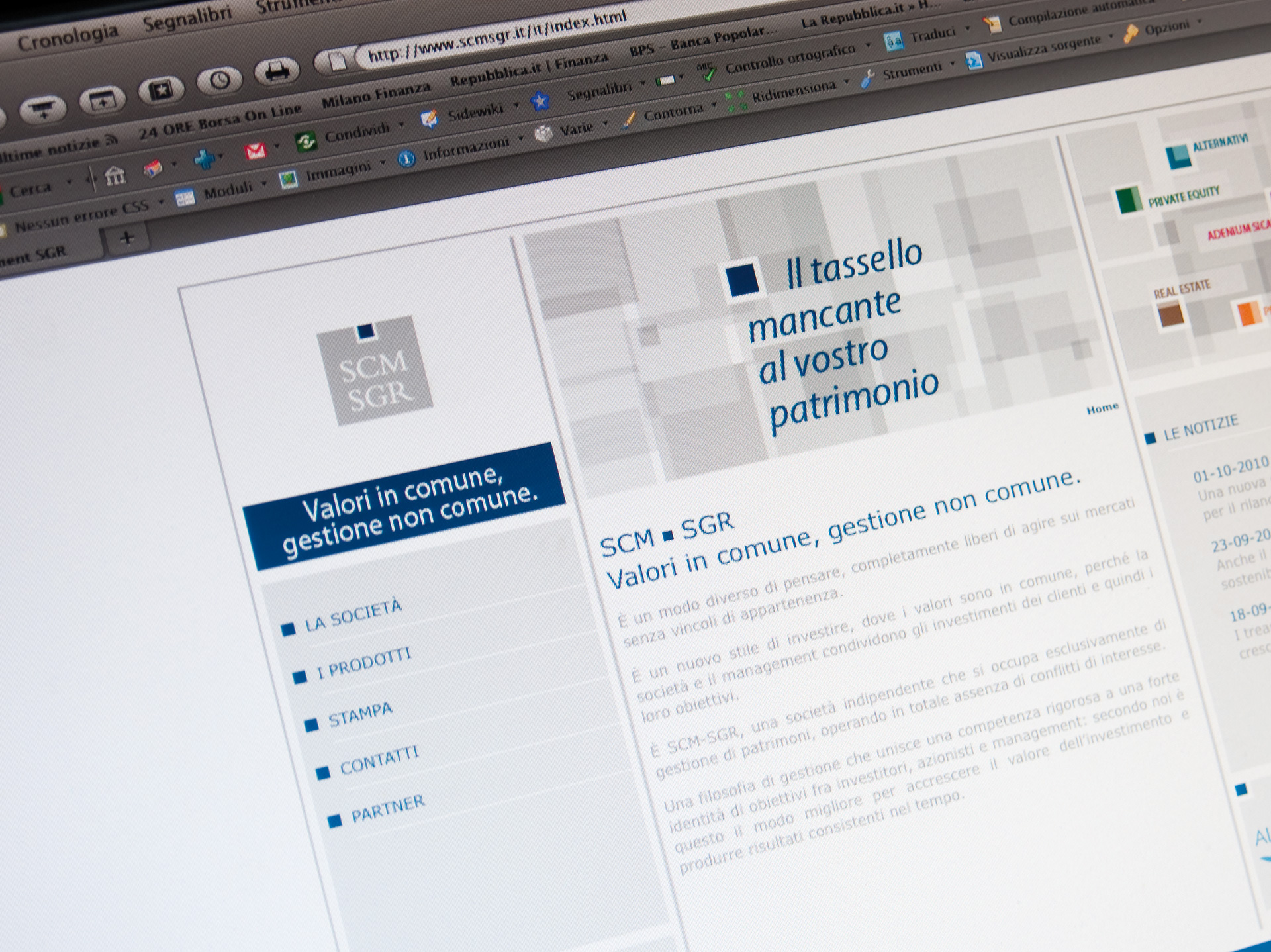
The restyling of the website is based on one fundamental goal: making the visitor feel comfortable. This is why a simple and intuitive graphic design was used, in line with the institutional graphics and that of the brochure, to create a “family feeling” at first sight. Already on the home page, all products are clearly visible, to make sure that every visitor can immediately find what he or she is looking for. And the home page also features the red thread of the ad campaign: “The missing piece in your capital”.