WeAre4810…WeAreFamily!
4810 brought on a new challenge: leading a brand that is deeply rooted in its territory and is an institution of reference for all of Valle D’Aosta towards change. Changing is not always easy, it needs to be done carefully and intelligently, and with the precise purpose of improving what you are. In the case of 4810, the starting point was the need to communicate a new role: the business was no longer just a sporting goods store and ski rental, but had grown into a Family which had evolved over time together with the territory and had become a point of reference for the local community, for seasonal tourists and for the entire Valley.
4810 is the representation of the values of the brand owned by the Grivel family.
Where did the new concept come from?
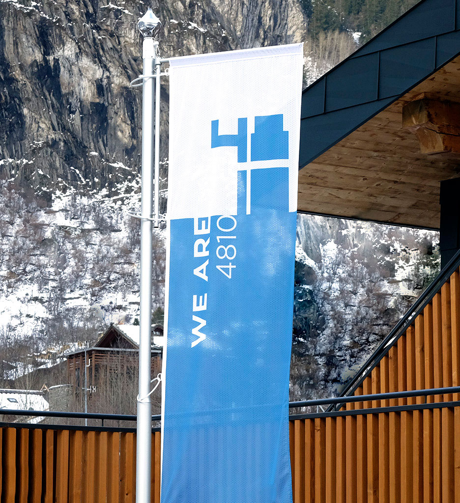
WeAre4810: the Brand of reference; the umbrella under which all the brand’s activities find their identity.
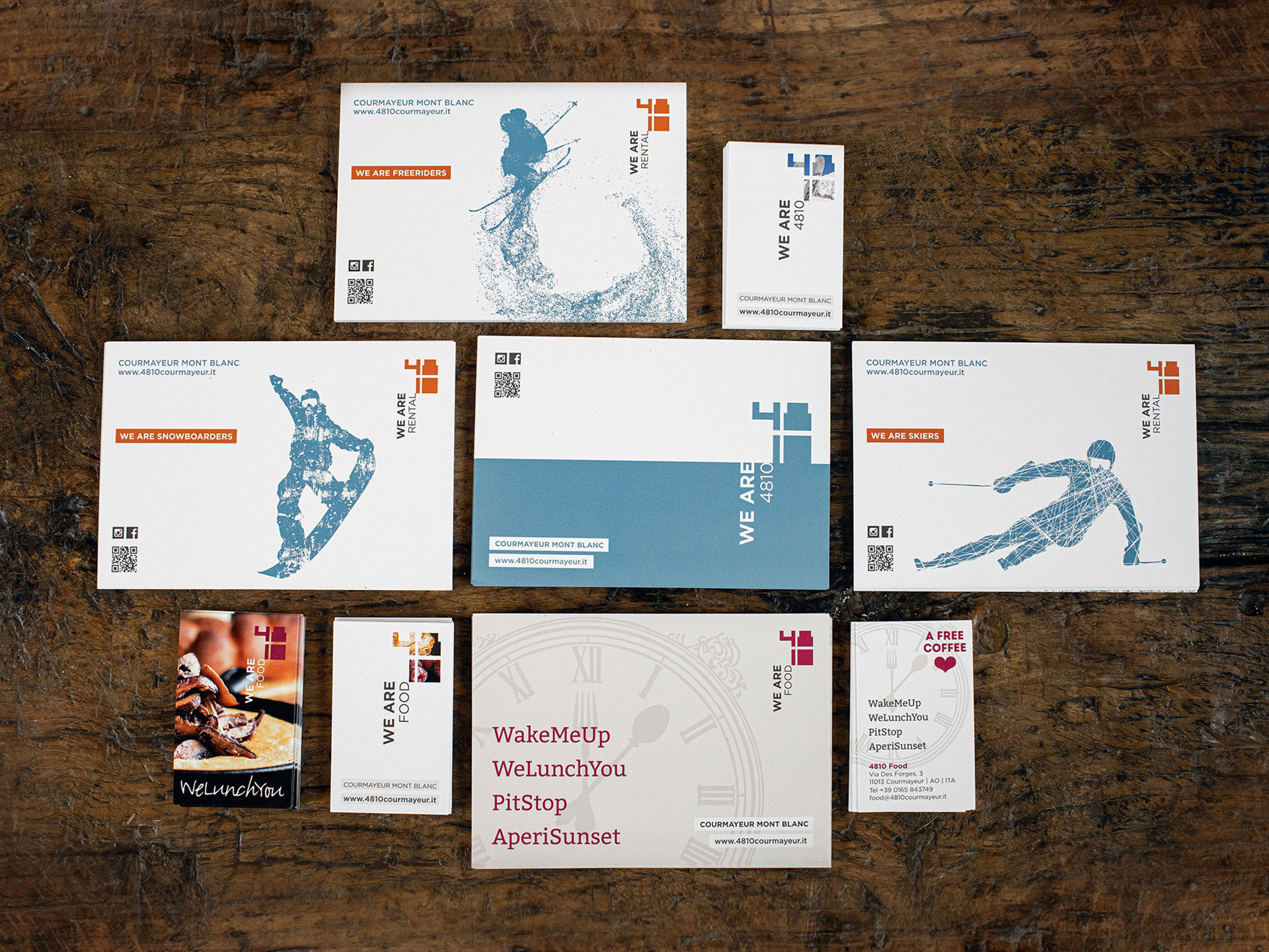
WeAreRental: professional expertise and warranty for rental of skis, sticks, boots as well as apparel and storage.
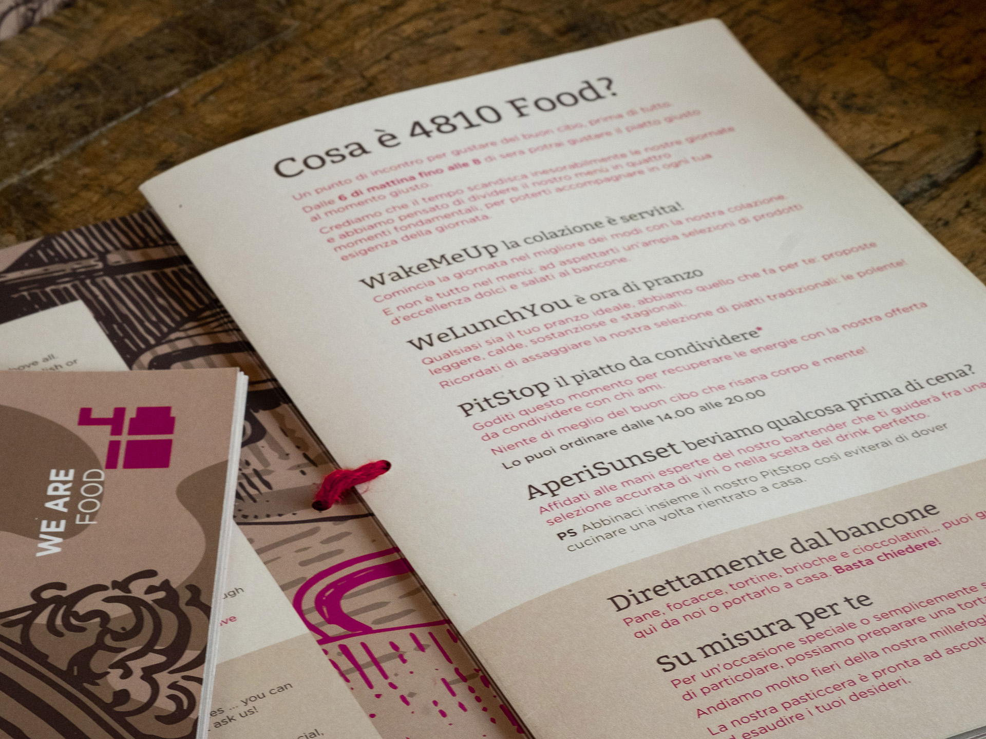
WeAreFood: A place where you start with breakfast, continue with lunch and go all the way to after-ski drinks, a place where warmth and friendliness are at the order of the day, a place where you can engage in and taste a different experience: not just a restaurant, but a ” appetizer heaven ” (appetizer heaven, appetizer bar, snack bar) offering a healthy, refined, and carefully studied cuisine which at the same time lies well within everyone’s reach.
We Are Shopping The points of sale dedicated to sports apparel, accessories and fashion are located in Courmayeur and in Dolonne
WeAre Outlet Promotions and offers you just can’t miss close to the Courmayeur store.
WeAreFamily a long family tradition rooted in the distant 19th century that began with the design of the first crampons.
The goal was to underline the fame of the name “Quarantottodieci” (4810), which had always been used by the Grivel family. It is inspired on the height of the Mont Blanc (4810m), a point of reference in Courmayeur, an umbrella that encloses ideas, objects, materials, and is fluid enough in its meaning to also include a numerical form.

The brand’s graphical form is based on the idea of using highly contemporary and solid figures, almost as a seal to guarantee quality and modernity. The figures were divided to convey the mood of “QUARANTOTTODIECI” clearly and explicitly.
Creativity then led me to the idea of using very modern and concrete numbers that could convey an idea of safety and modernity. Numbers that could themselves become a container of images, which communicate the concept of each division.
Each division is represented by a different colour.
Light blue is the colour used for the brand of reference as it evokes the peak of Mont Blanc when the mountain reaches the sky.
For the shopping section I chose the colour green as a reference to mountain vegetation and because it represents abundance in the general sense of the term. Its symbolism refers to absolute balance, which is made of harmony and positivity.
The colour orange was chosen because it evokes the professionalism of the staff and the precision of the rental gear offered at the Rental store.
Food could only be associated with red, the colour of wine, strawberries and the colour of a healthy passion for good local food.
The choice of brown for both the texts and the “WeAreFamily” concept is a reference to the land and to nature and helps to convey the expression of balance in all my work.
In general, the colour range expresses elegance, safety and tradition. This is why I chose to exclude excessively loud hues which did not fit in with the re-branding project.
The “Gotham” font is, on the one hand, a recovery of the 2008 version which became trendy again thanks to Obama’s political campaign “YES, WE CAN”. On the other, it seeks to express freshness, modernity and honesty by means of a fringeless visual. An essential font which is nonetheless loaded with the experience of the past and of tradition, just like the Grivel family and 4810.


Food has had an essential role in the entire operation of evolving the 4810 brand.
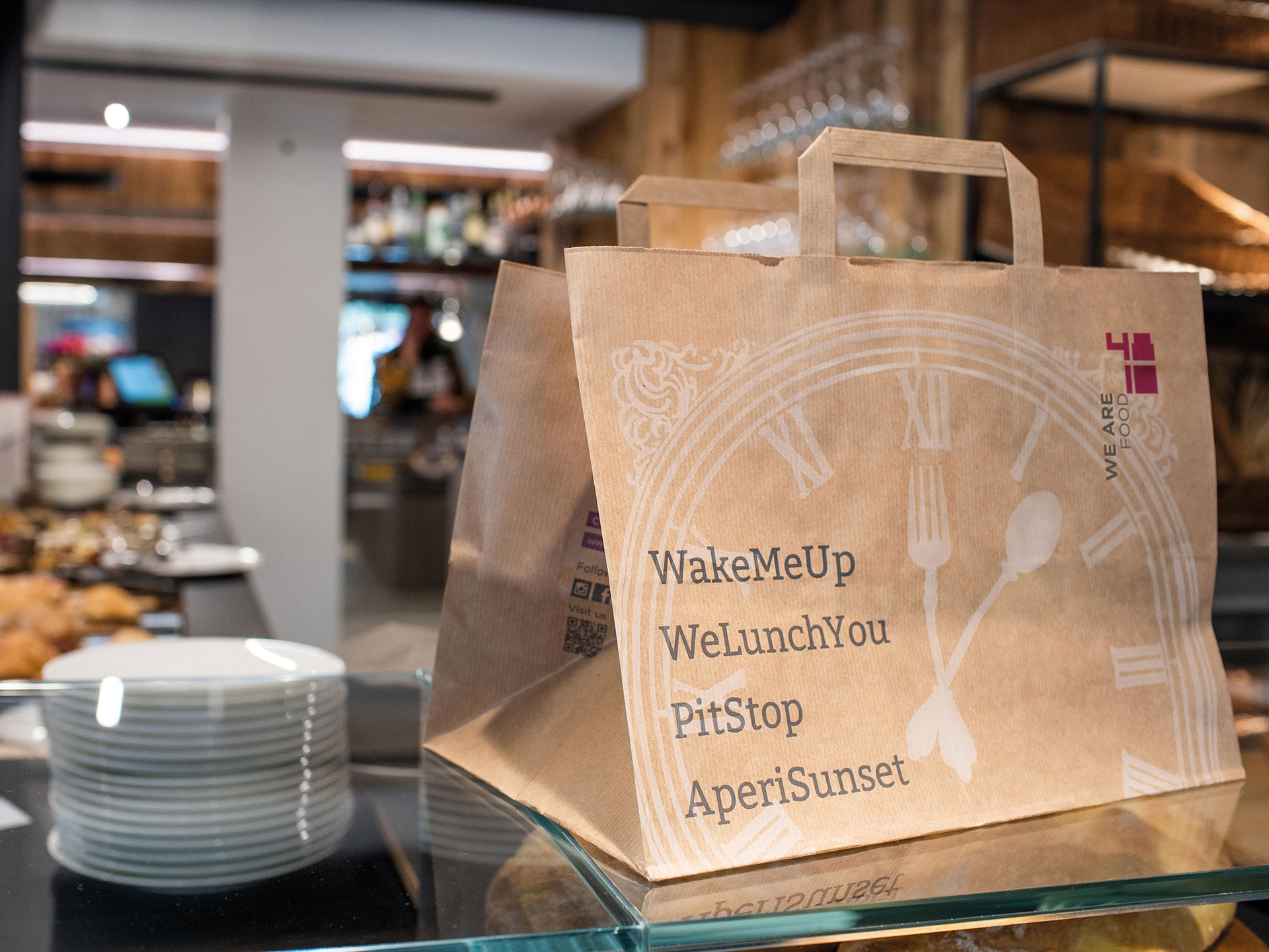
4810 Food is not a simple restaurant, but rather a common space where you can get off on the right foot with a rich and healthy breakfast or where you can taste typical local dishes during lunch or grab an afternoon snack during the afternoon or maybe pair it with a good glass of wine to end your day in fine style. All this at the departure for the slopes for skiers, mountaineers, guides and ski instructors.
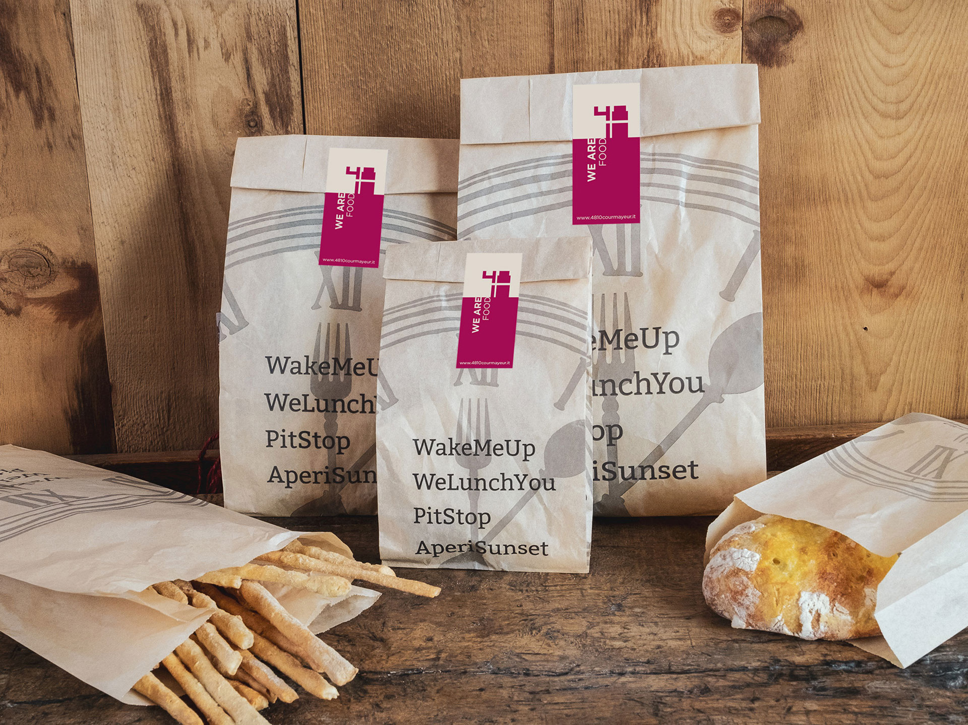
The challenge was to represent the passage of time during these different moments of the day. I solved it thanks to the idea of a clock. A clock that defines a fluid space divided into 4 moments:
WakeMeUp breakfast is served!
WeLunchYou it’s lunch time
PitStop a tasty dish to share
AperiSunset would you like to drink something before dinner?
A modern naming for an international audience, all united by the time marked by a clock whose arms are represented by a fork and spoon to remind everyone that this is a place you seek out to eat!
But the clock also reminds us never to forget tradition, since the entire space is a mix between past, present and future. Evolving is necessary, but with a firm eye always addressed at the past to keep in mind what has been and remember the experience that the Grivel family has skilfully cultivated over time.
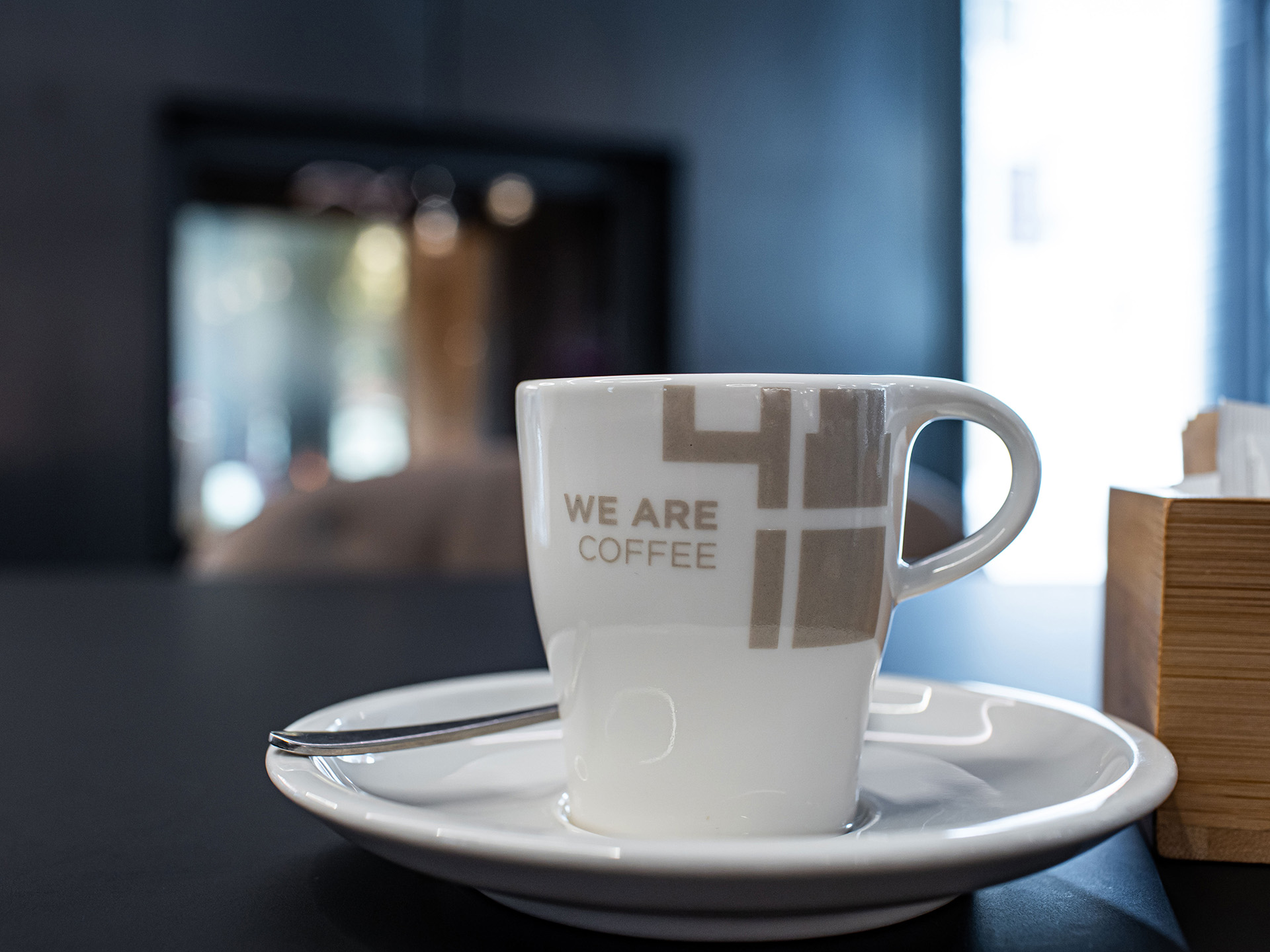
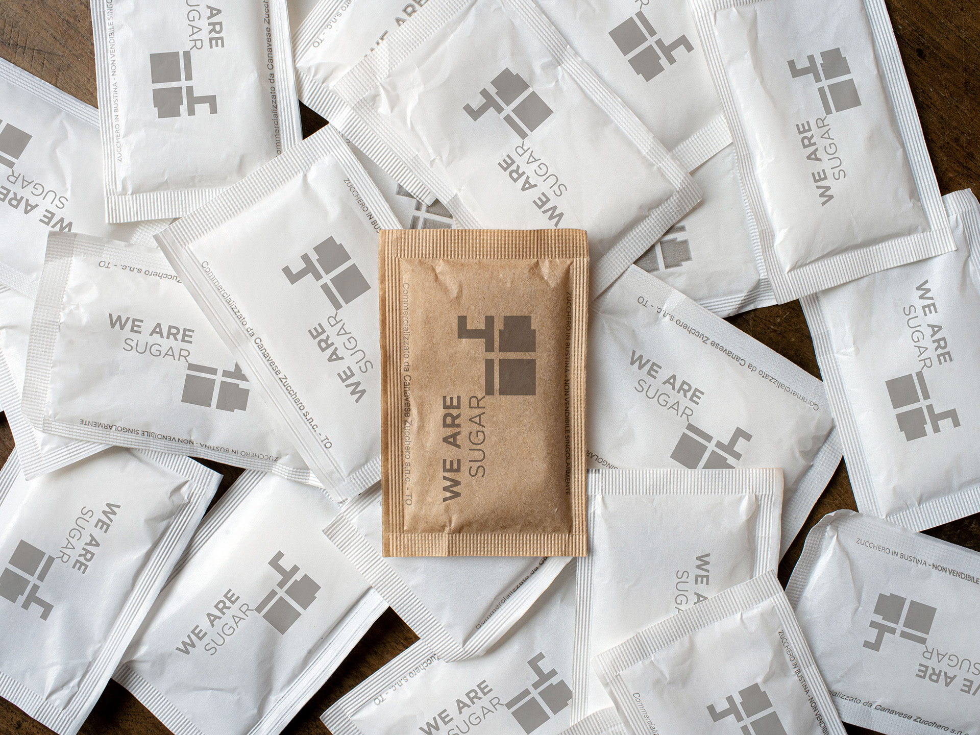
In the Dolonne location, the entire brand identity was created from scratch; the brand identity being all the graphic and communication elements that determine the perception and reputation of a brand on behalf of its audience of reference. From the business card to the menu, the signage, the coffee cup “WeAreCoffe” and to the sugar bag “WeAreSugar”. Everything has been declined and customized thanks to a multifunctional brand that needs to communicate several things at once, without ever losing its intrinsic power.