Labels for the nature of hair.
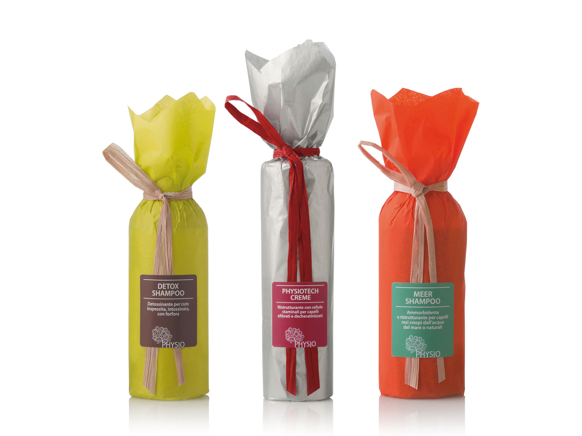
Physio compares our hair to a plant with its leaves, as if it were the tree of life. This is why it created a line of 100% natural, healthy and highly performing products.
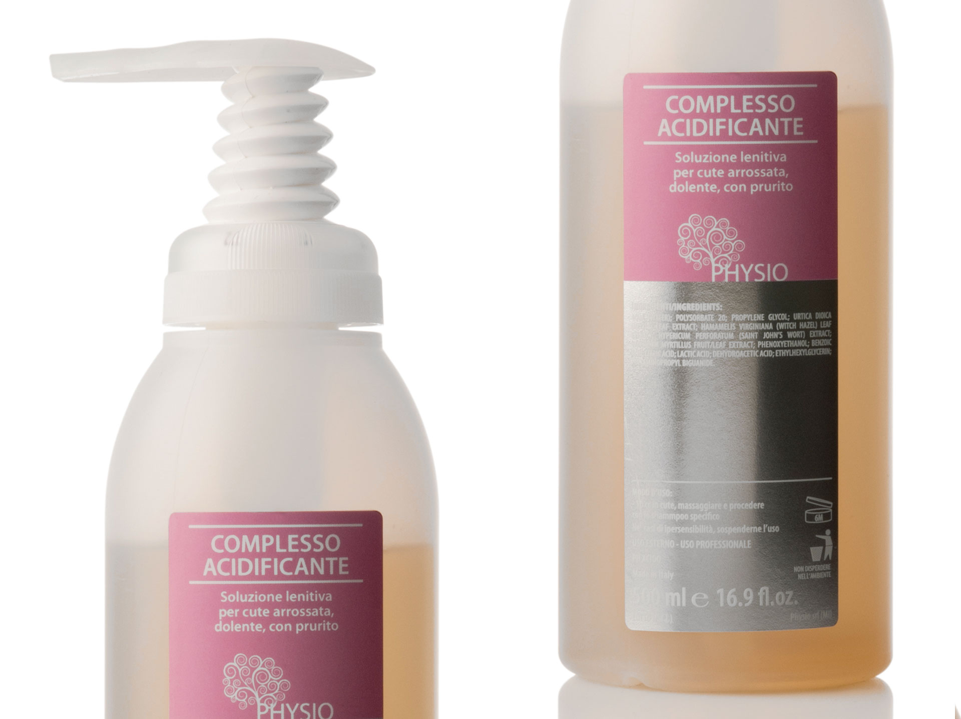
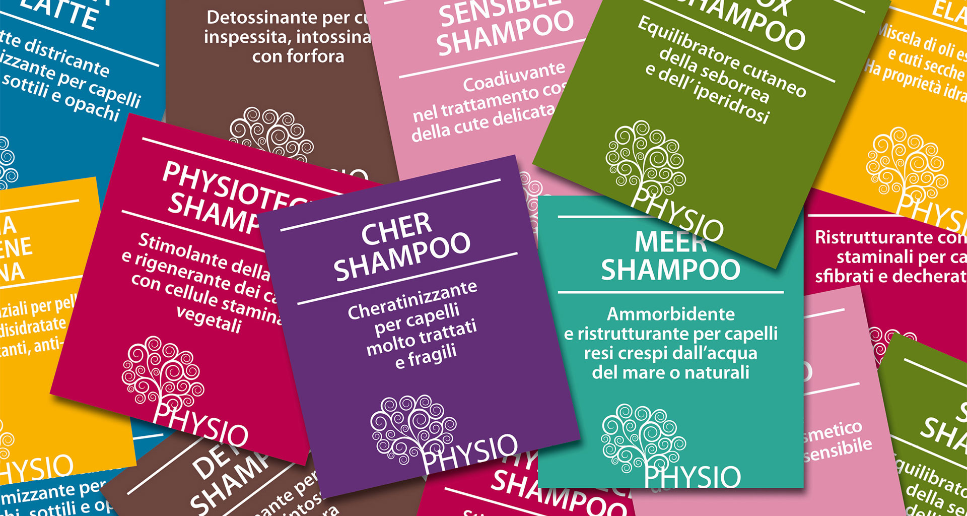
I started designing labels for the brand and, by means of different colors, I wanted to express the different properties deriving from the use of the natural products. I studied 7 lines combining them with 7 colors: Red for revitalizing products, Blue evoking the purity of water for the moisturizing line, Brown like the earth for the detox line, Pink for delicate products for children, Green like the woods and their rich nature for sebum-regulating products, Purple to represent the importance of the Keratinizing line, Yellow to express an explosion of emotions for phytotherapeutic oils, and, finally, Silver like metal for the special line.
Later, I created the external packaging with tissue paper and raffia to obtain a very natural and impactful result.
A small catalogue on three-sided spreads simply and immediately reproduced their entire line and explains the characteristics and use of each product.
LABELS, PACKAGING, BROCHURE.