The Mosnel QDE 2006: a well-balanced conjunction between company, territory, and product.
The Jury of the Mosnel Award “Questione di Etichetta”, summoned on September 5th, 2012 in Milan, unanimously assigned the award to the label created by designer Laura Ferrario, whose excellent work perfectly combined the values of the territory with the Brand communication of the company and the uniqueness of the product. The label is easy to recognize, refined, and it creatively communicates the characteristics of the product. All aspects of the packaging and color variations proposed were solved consistently in a top-level graphic presentation. The Jury voted in favor of the version with a transparent background and golden graphics for a higher readability of the brand”.
LABELS, PACK.

To date, the project has won 4 more national and international Awards.
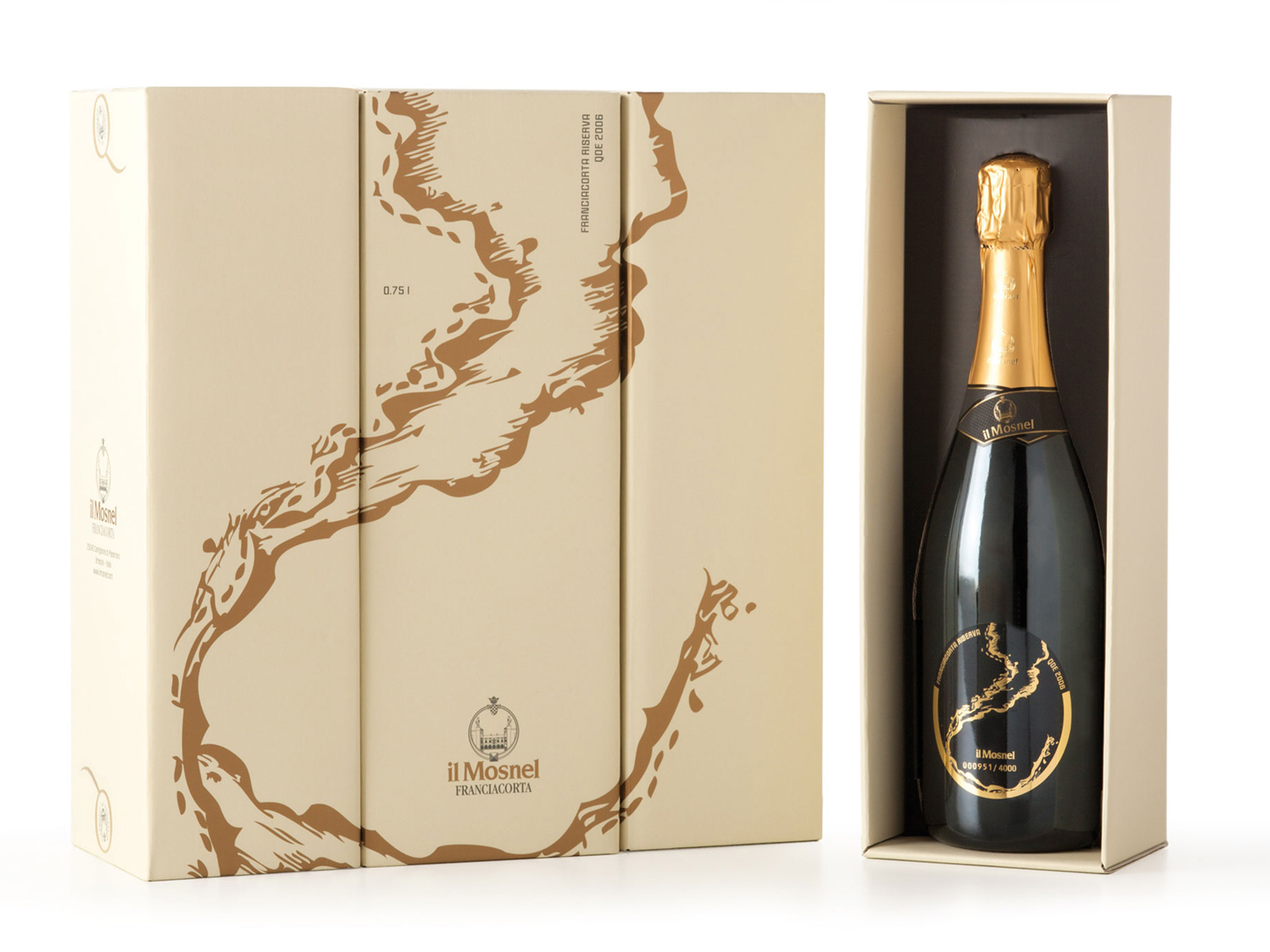
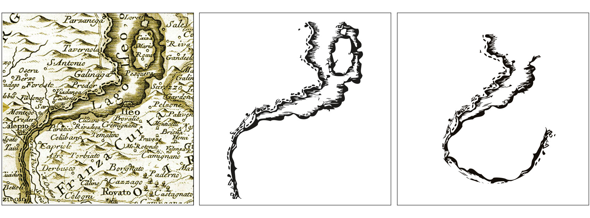
To make this label, I was inspired on Franciacorta, a splendid region South of the Iseo Lake, in the province of Brescia, which extends all the way to the Moranaic hills. The concept of the label is based on a graphic re-elaboration of the historical image represented by the shape of the lake: just like the Iseo Lake washes on the banks of the Franciacorta region, this sparkling wine pours generously into the glass, enclosing all the energy of a freshly uncorked Riserva bottle.
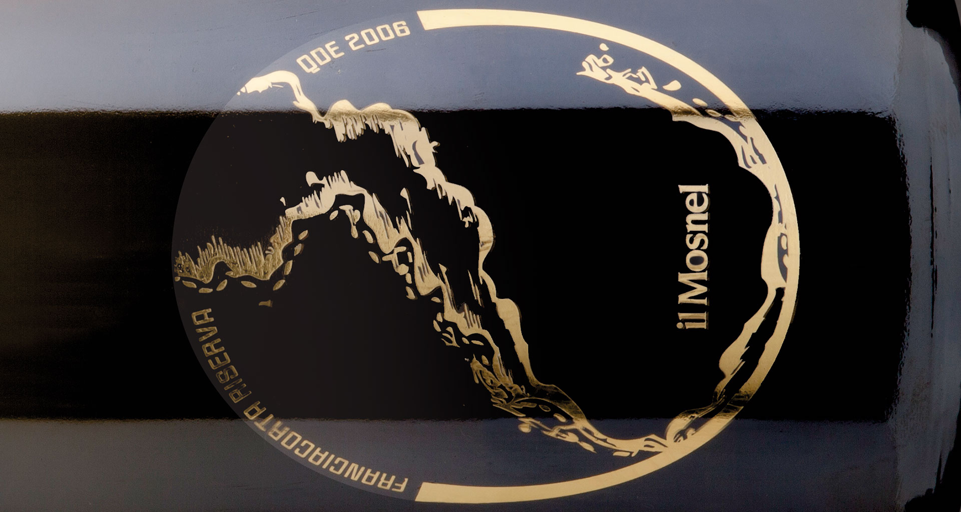
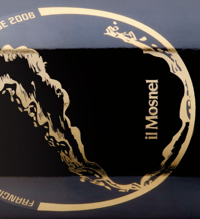
My proposals range from the “classic” design in black to gold, using a very matt paste colored paper to make it even more visible on the shiny glass of the bottle, 1 matt silk-screen gold to differentiate the texts, the glass, and the brand from the flow of the wine, which will be in shiny foil. The result is a classic and elegant label. The proposal has many variations, all the way to a matt creamy background: 1 matt silk-screen gold for texts and brand, and 1 shiny gold foil on the graphic sign and the glass to let the flow of the wine become one with the glass.

In the end, I wanted to be bold and use transparent polypropylene to convey new sensations: the glass is no longer die-cut and the texts blend in more with the graphic elements. In this way, by applying an entirely transparent label, you can read an exact oval shape. Entirely gold-foil stamping to underline the simplicity and elegance of the product. Light and dark colors, matt and shiny, contrasts and balances to evoke and trigger the sensations, emotions, and tastes that the Riserva has in store.

The energy of bubbles flowing out of the bottle is further enhanced by the box: simple and impactful, it is composed by two “slive et tiroir” elements that compose a very precious casket. A treasure box holding all the expectations of the Riserva, sealed with a particular closure marked QDE. The perlage colors evoke a concept of luxury that further stresses the prestige of the Riserva wine: gold for the 1.5 l. bottle, and cream color for the smaller version. For the inside of the box, I chose a matt black color to create a higher contrast with the shiny texture of the bottle.
The goal of this project was to start from the celebration of the territory that gave me the inspiration to create a project studied in every detail, and convey prestige, quality, and luxury.