Aser, Service Company in the Rho Area:
a brand at the service of all citizens.
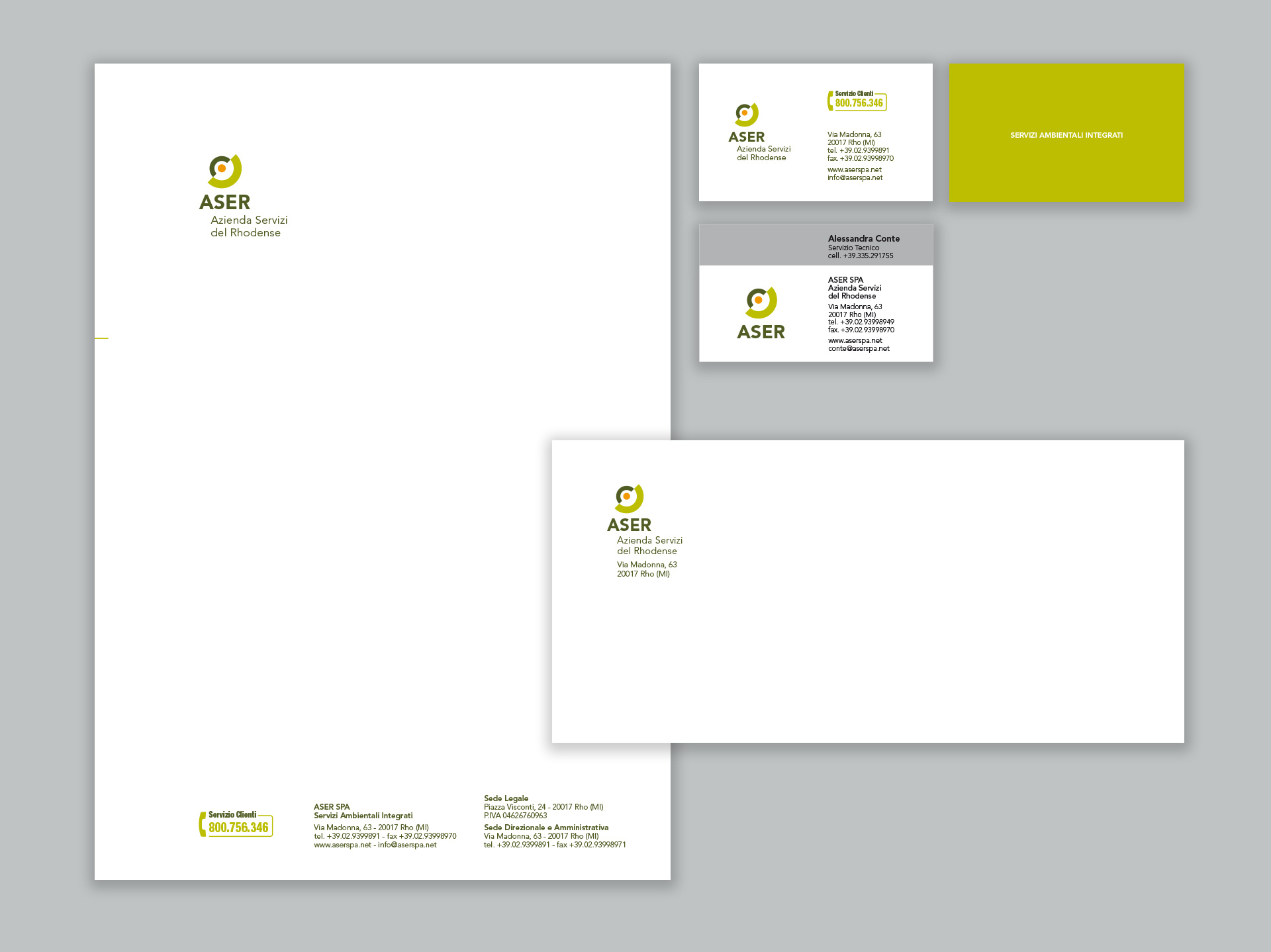
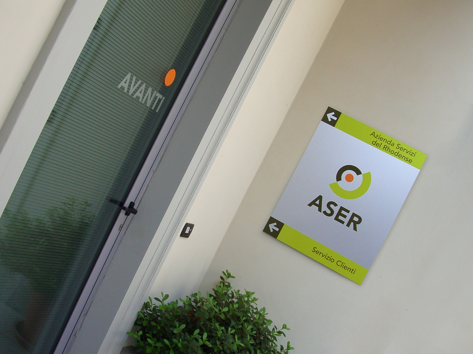
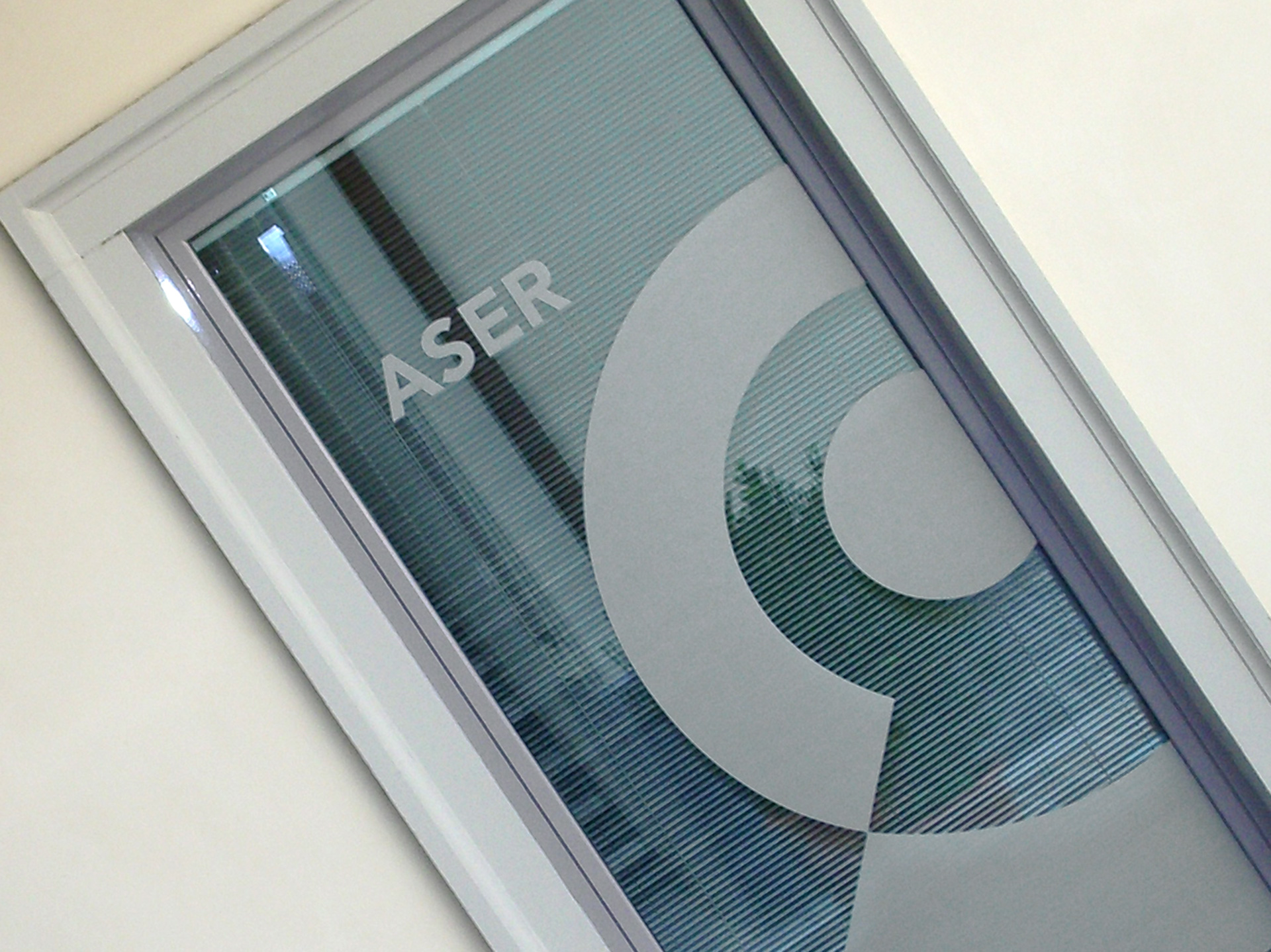
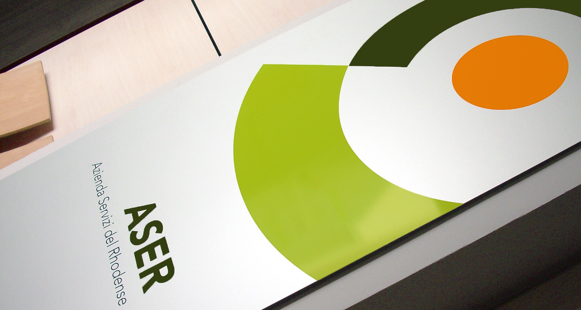
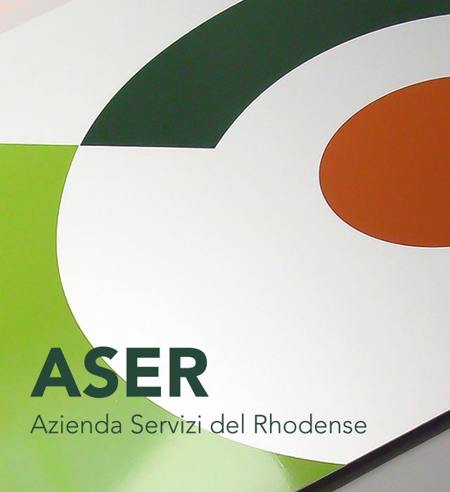
I took the inspiration to create the brand ASER from the very heart of the company’s activities for the citizens of its region. The brand is a “dot” embraced by two strong and welcoming arms, which represent the feeling that the citizens should feel when enjoying ASER’s services. This company dealing with municipality services works in the fields of environmental hygiene and maintenance of public green areas, but, at the same time, it is also a point of reference for other companies who need its services.
The colors I chose for Aser’s communication are the nuances of Nature and cleanliness. The use of the orange color, on the other hand, is meant to underline a focal point: the services for citizens become the true protagonists of this project.
BRAND IDENTITY, CORPORATE, SIGN DESIGN, ADV