Le Coffret Design House:
A B&B in the heart of the Aosta Valley.
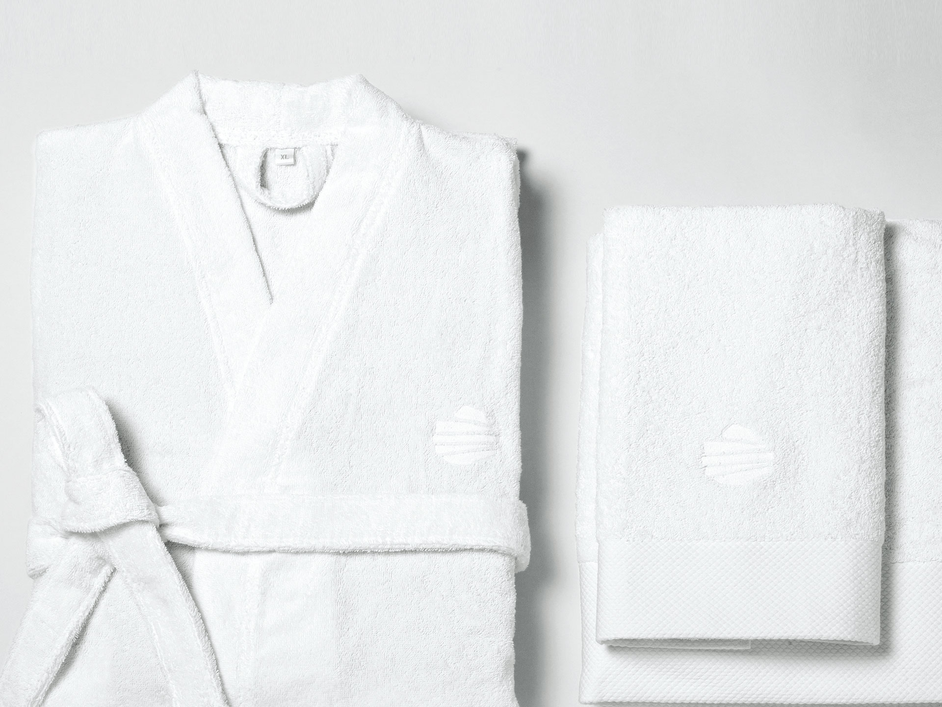
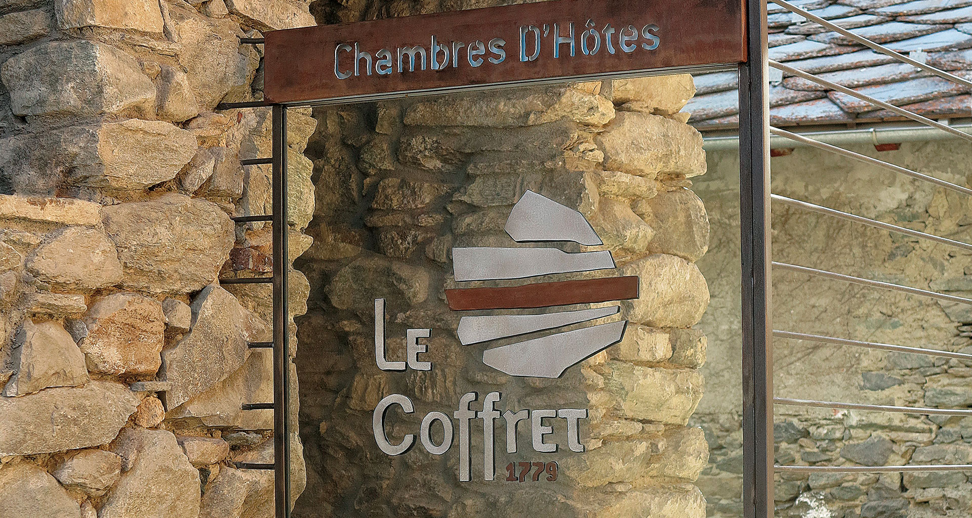
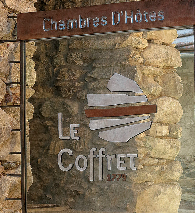
The true challenge of renovating Le Coffret was maintaining the atmosphere of a house from 1779 and making it coexist in perfect harmony with the most sophisticated modern comforts. The choice of materials for the renovation was determined with this in mind: the stone walls, wooden beams, and furniture in the style of the period were the perfect ingredients to attract the guests’ attention and, more in general, the attention of anyone in love with beauty. When creating the logo, I used all the elements that characterize the former historical home, such as wood, stone, the ancient, the modern, and the mountain landscape. The circle symbolizes the sky; the triangle is meant to represent both the mountain, the environment in which the B&B is set, and the ascent of man towards the skies. Even the choice of the font is 0 KM; in fact, I chose an Onciale revisited in a modern key as a reference to the Celtic origins of the Aosta Valley. The result is a very strong and recognizable symbol. My work was declined not only in the logo and the Brand, but also in business cards, bed linen for the B&B, invitations, signs, and web design.